MCH&HS Rebranding
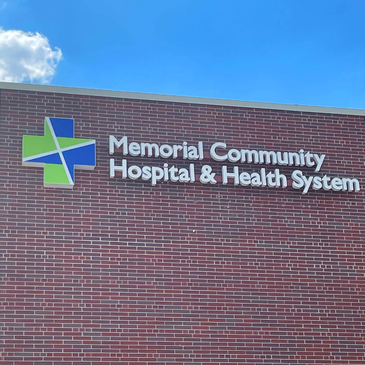
The next time you visit Memorial Community Hospital and Health System (MCH) you may notice something new on display. Signage displaying the health care system’s new logo was recently installed on the building wall facing the main hospital parking lot. The hospital’s new symbol that is a part of the logo was also placed on the building and is visible to those traveling along highway 75. The new signage is part of MCH’s rebranding campaign that began January 1, 2021.
On average, businesses rebrand about every 10 years, a process that often involves restyling the color palettes, logos, photographic style and visual language. While there’s often one main reason, a combination of factors can motivate a rebrand. In MCH’s case, a more recognizable name and updated look was the motivation. “A rebranding process is a lot of work, often taking months to update materials, forms, signs, web site, and all other areas where the old logo appeared,” said Molly Dahlgren, Marketing and Community Relations Liaison at MCH. “We are pleased with the new look and it is wonderful to have our new logo and symbol displayed. The feedback has been positive, especially concerning the colors that were chosen.” MCH staff as well as board members and community members were involved in the choosing of both the symbol and the colors through a voting process. The next steps in the rebranding process will involve addressing the internal signage throughout the facility and additional standing signage near the parking lots. Once these areas are updated, the rebranding process will be complete.


