Introducing Memorial Community Hospital and Health System’s (MCH) New Look
On average, businesses rebrand about every 10 years, a process that often involves restyling the color palettes, logos, photographic style and visual language. Brand identity is what you, customers and prospective customers can see, including color, design, and a brand’s logo. It’s the manner in which a business presents itself to the public and distinguishes the business in the mind of consumers. In some cases, changing the name might be necessary. While there’s often one main reason, a combination of factors can motivate a re-brand. In Memorial Community Hospital and Health System’s case, a more recognizable name and updated look was the motivation. The new look had nothing to do with ownership of the hospital which will remain the same. A name change was discussed during the process; however, it was decided the name would remain the same, believing that Memorial Community Hospital and Health System stands for a tradition of caring for patients in the communities it serves. A new look, however, was needed. Often people who see the current logo do not know what MCH stands for and where we are located so adding our locations was reflected in the new logo, along with brighter colors. Hopefully, this will take away some of the confusion experienced over the last 10-15 years and will give the hospital a fresh new look.
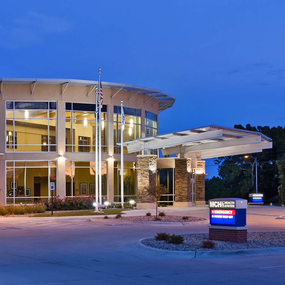
The roll out for the new logo will begin January 1, 2021. Many steps are essential in a re-branding process so the changes will be gradual. Initially, replacing the logo on paper documents, brochures, in advertisements, on the website, and on Facebook among many other things will occur. By the end of 2021, the goal is to have all signage updated and complete on the outside and inside of the building.
“We are excited to introduce our new look to the community,” said Molly Dahlgren, Marketing Lead. “This enhancement will strengthen our brand and be a reminder to all of our commitment to those we serve. We want our new logo to be a symbol of strength and to accompany our mission which is to partner with our community to heal, nurture, and promote wellness.”


